You are here
Visualizing Data for Better Decision-Making at the CRC
Pitt’s Center for Research Computing (CRC) provides researchers with free access to advanced computing hardware and software, along with training and consultation by CRC research faculty. University faculty are able to perform resource-intensive functions, such as simulations; data, image, and text analysis; and genomic sequencing to help give shape to innovative ideas.
When Kim Wong and Adam Hobaugh became CRC co-directors in November 2020, their first order of business was to gain better visibility into who was using the CRC computing clusters, how much, how often, and for what purposes. So they reached out to Pitt IT’s Analytics team to develop a full dashboard that provides CRC with insights to make data-driven decisions for better supporting the Pitt research community. Now that dashboard is piquing the interest of Pitt Research and units across the University, as they explore how easily-accessible and graphically-presented data can support their strategic planning.
 Where It Started
The CRC website previously displayed a basic utilization chart showing how busy each cluster was at any given time. It made it clear when a particular cluster was nearing full capacity, and helped researchers know to plan accordingly and work on a different part of the project while jobs are queued awaiting allocation of resources to run.
But a basic snapshot doesn’t show the full picture for capacity planning, determining which researchers and departments need hands-on support, or identifying opportunities for better engagement.
“We wanted to better understand resource utilization in both the near- and long-term,” Hobaugh explained. “Making information available to the CRC team, the Pitt research community, and leadership was important for our transparency and community-building goals.”
How It Got Here
Nalyn Siripong, a data scientist with Pitt IT Analytics, met with Wong and the CRC team to determine which high-level metrics would be most useful, as well as where the data can be pulled from and how it should be visualized to make it usable for decision making.
“Not everything that can be shown should be shown. It’s important that we choose metrics that are meaningful, that help us understand CRC users and their needs in a way that contributes to making informed decisions,” Siripong explains.
After the Operations team programmed the dashboard, they worked closely with CRC leadership to adjust to how the data was presented for maximum usability.
Where It Is Now
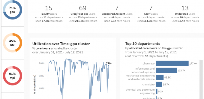
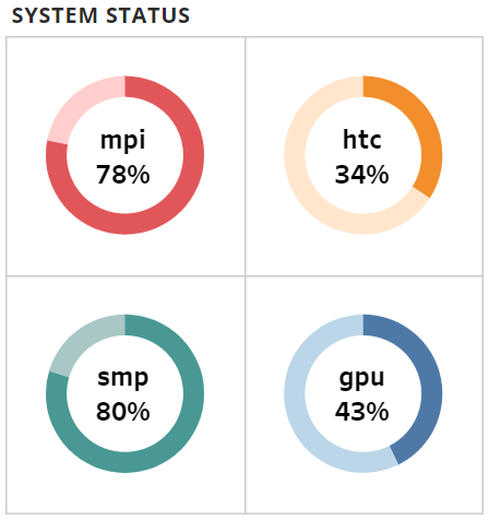
When you go to the CRC homepage, users can still see the original System Status wheels, for a quick view of available compute capacity. But now you can click the Statistics Dashboard link to see expanded data about the clusters.
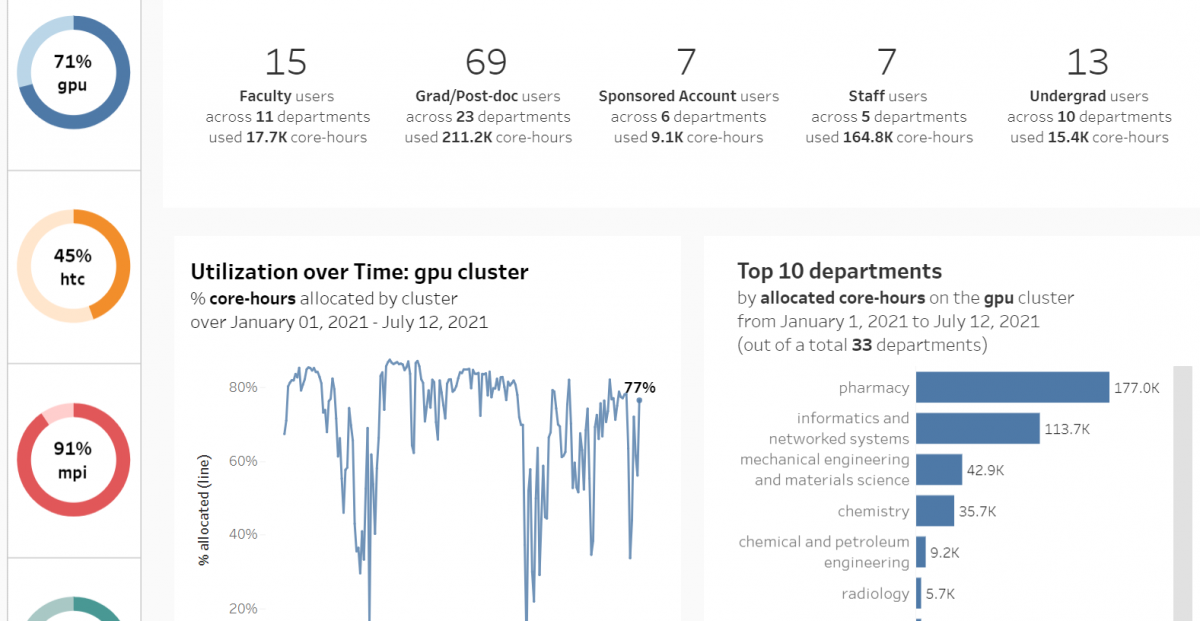
The dashboard displays utilization of each cluster over time to analyze utilization patterns. It also shows which resources departments are leveraging and how many core hours they’ve utilized. In addition, the CRC can dig down to even more granular data for examining the core hours used by individual research groups, as well as specific users. (At the moment, this level of detail is restricted to CRC administrators and not displayed on the public dashboard.)
The dashboard is accessible to anyone affiliated with Pitt. “The user community can quickly get a sense about wait time for access and what levels of resources are possible on one cluster as compared to another,” Wong explains. “From the CRC perspective, the dashboards provide data to inform decisions in our roadmap planning.”
“The dashboard enables efficient distribution and planning of current and future CRC resources,” Hobaugh elaborates. “And just as important, it offers significantly more insight and transparency than was previously available to our community.”
Where It’s Going
The CRC Statistics Dashboard has been incredibly successful. “Many people don’t know who to ask or where to go to get data that can help them understand their environment,” Siripong explains. “This type of dashboard does the work up front, to eliminate the time-consuming and labor-intensive process of getting actionable data.”
The CRC dashboards have also piqued the interest of the broader research community. Senior research leaders are asking questions about how they can collaborate with the CRC and Pitt IT. They are actively exploring how analytics dashboards can be used to understand research activity at Pitt, beyond high-performance computing clusters in the CRC. For example, research impact can also be gauged through the lens of publications, media coverage, or the number and value of grants awarded.
Other units are also exploring how a dashboard can provide important insights into their own operations. Pitt IT Analytics collaborated with the Covid Medical Response Office to provide dashboards that monitor infection rates, contact tracing, quarantining, and other pandemic data. The team is also working with Fiscal Panther to develop a 360-degree view of financial data and assist in grants forecasting. In addition, they are developing graduation dashboards to provide academic advisors and administrators with more information to assess whether students are on track to meeting graduation requirements and to identify students in need of more support.
How can data help your department understand the work you do and the people you support? Contact the Pitt IT Analytics team to find out!
-- By Karen Beaudway, Pitt IT Blogger